DeletedUser
Thought I might steal it!
") text is every GFXers worst nightmare
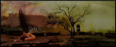
text is every GFXers worst nightmare I feel like you could've added some more stuff on the last signature (Robotics). It's a bit too empty on the right side.
Did you a sig aswell
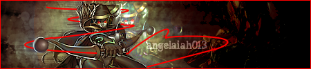
Avvy;
Sig;
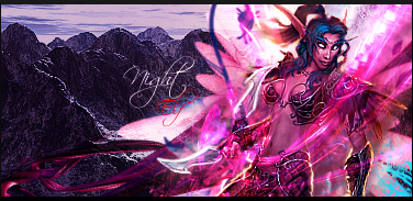
i think i was lost att time..anyway ... thanks//i love it so much ^^ and i also like te night elf ^^...can you create another one maybe bigger and wit te name West Angel XIII? i will use it for my dota sig 
 .
.