Hellstromm's Tutorials

DeletedUser

[jumpfrom]table[/jumpfrom]This thread serves to link all future graphic/writing tutorials made by moi:

Photoshop
  • [jumpto=basics]Important Basics[/jumpto]
  • [jumpto=copyright]Copyright & Usage Licenses[/jumpto]
  • [jumpto=free]Free Alternatives to Photoshop[/jumpto]
  • [jumpto=wood]How to make Wood[/jumpto]
  • [jumpto=parchment]How to make Parchment[/jumpto]
Writing

Cryptical also provides tutorials on GIMP here ---> GIMP Tutorial
 
Last edited by a moderator:

DeletedUser

[jumpfrom]basics[/jumpfrom]Important Basics

1. Graphic Formats (the basics)

Lossy vs Lossless
  • Lossy compression is a compression format that cause a loss of quality in a graphic, but makes for smaller files. Use lossy formats for net use.
  • Lossless compression is a compression format that leaves the graphic intact (no quality loss). Use lossless formats for print.
JPG is a lossy compression graphic format, which means it uses approximate matches of repeated strings in order to compress the file, thus causing a loss in quality from the original. However, this sort of compression allows for very small files, which is important for web use. I find an 80% JPG compression to be optimal quality-to-compression ratio, allowing for high quality whilst providing a very small file size.

PNG is a lossless compression, although some programs allow you to impose a lossy compression, which further compresses the file, at a loss as above. There really is no reason to use lossy compression for PNG, and most people do not. Scratch that, there's one reason, which is to have a compressed transparency, but I find the lossy compression on PNGs is just too brutal and, frankly, if you're going to work with a transparency file that is so big, you're doing something wrong.

TIFF (TIF) is a lossless format that usually leaves you with a huge file, not usable on the net, but is great for print. However, for print purposes, I convert everything to PDF (print standard), just to make sure the printers don't override and flip colors. (note: there are different PDF save settings in Photoshop, and just about every other program, so be sure to choose print standard with embedded fonts).

Other formats exist, of course, and while some are old (GIF), others useless (BMP), there are still others useful for different purposes (cross-stitch patterns for embroidery, etc).

GIF is still a valid format if your art has limited colors (256 colors or less). Converting vector graphics to GIF is recommended, again assuming limited colors (most vector graphics have only a handful of colors, unless you used gradients in excess).

Transparency

PNG and GIF both allow for transparency, but PNG is better because of the lossless compression (again, this assumes the original graphic has more than 256 colors).

Print

For print, what matters most is pixel count per square inch. The higher the better, but too much and the printer will crap a brick, your graphic program will slow to a halt, and your newborn will have gone to college. As I mentioned above, PDF is the standard format for print. As the focus of tutorials here is on net use, I will not delve into print settings, particularly because it can get pretty deep.​

2. Work Space
File Size

For all practical purposes, work with 2x to 4x times the size of your intended final product. For example, if you intend on presenting a 600x720 pixel final render, start with a file size of 1200x1440 or even 2400x2880 pixel size. Do note: the larger you make it, the finer the work you can present. But, you also will be dealing with longer rendering times (time it takes the computer to implement any image adjustments, particularly complex filters). So, consider your computer's limitations and try to work within your limitations. *chuckle*

Once you're done with your work, File -> Save, then Layer -> Merge Visible, then Image -> Image Size (in that order). And be sure NOT to save again. Instead, File -> Save As or File -> Save for Web, then File -> Revert. Make that last step a habit before closing Photoshop, or you'll eventually end up making the horrible mistake of saving all your work as a merged image.

Modes

If you click on the menu, Image -> Mode, you'll see a lot of options. For our purposes, I'll leave us with only four to consider:

RGB - This will be what you'll use for ALL your Photoshop work. Without getting technical, RGB stands for Red-Green-Blue, and is what your monitor (and television) displays. For this reason, it's what you want to use when you're developing any art.

CMYK - This is what you'll convert your art to if you want to take it to Print. Again, without getting technical, CMYK stands for Cyan-Magenta-Yellow-Black and is what printers utilize. Unfortunately, CMYK is not what you see on your screen, so what you see is not what you'll get. My recommendation is to do print samples (small scale) to test whether the colors work for you. If not, nudge and nag until you get the proper results. (note: do all your work in RGB, then convert to CMYK when you're done. There are many reasons for this, not the least of which is that you'll find a lot of your filters disabled in CMYK mode).

Grayscale - Hey, like is says, it's Grayscale. I do all my work in RGB and then convert to grayscale if it's going to be a grayscale print. In the past, that's not what you would have done, but both Photoshop and printers are pretty cool nowadays and they handle the subtleties of grays far better than in the past. Still, if you know your work is going to be grayscale, it's a good idea to switch back and forth, for visual sampling (verifying your subtleties in color don't end up being blurred montages in grayscale).

Indexed Color - Okay, I'm going to be honest. I never use this mode. It's old-school crap that was really friggin' important when the Net consisted of 2400 baud modems. It's used primarily for GIFs, sometimes for TIFF, and just edges out a little extra file space, making files a tad bit smaller. As it indexes colors in a palette, it is limited in color (256 or less). Only GIF and TIFF can utilize index coloring extensively, but seriously --- old school.

Contents

Make it easy, just choose Transparent.​

3. Layers

Choose Window -> Layers. A check mark indicates the item is showing. Do the same for Channels and Paths.

There are a few important things to understand about Layers:

1. Use plenty of layers. In fact, when in doubt, use another layer. Layers are what differentiate Photoshop from a lot of other drawing/photo-editing programs. It allows you to setup, just as it says, layers of photos/art. Once you get competent in the use of layers, you can perform various tricks to simulate 3D, shadows, shades, and other high-end effects. The thing to understand about layers, is that they are on top of, or below, other layers, based on where you place them on the board.

layer1.jpg


2. Name your layers. By default, Photoshop names layers as, "layer1," "layer2," etc. Obviously, when you're trying to find a particular layer, trying to remember which layer# is which is just about impossible. So be smart, give each layer a name. Make it a habit. (To name a layer, just click on the default name, then type in a new name).

3. Stay organized with Sets. Version 7 and up uses what are called Sets, which are essentially folders where you can put similar layers together. Sets follow the same rules as layers, meaning they can be placed above or below other sets. They also can be adjusted (everything in a set, adjusted together), as will be discussed below. If you've never gotten carried away with layers, no big deal. But, to really take advantage of Photoshop, you must follow my #1 recommendation. And when you do, those layers are going to be just too much. Use Sets, they'll seriously keep your work organized and help you maintain a modicum of sanity.

layer2.jpg


4. fills, adjustment layers, vector masks, layer styles, channels and paths

Okay, there's a buttload to cover on all these, so I'll make it simple. Each allows you to edit and tweak your layers/sets in very different ways. I will cover how to use some of these with the various tutorials. For now, let's just expose you to them:
  • Fills and adjustment layers allow you to make changes to your layers without changing the original layer (tbh, I don't use fills and adjustment layers all that much, as I'm able to do the same dang thing with just copying a layer and tweaking that copied layer separately from the original. However, I will cover it and explain the benefits of using these).
  • Vector masks. Tbh, I don't use vector masks all that much. I find myself just cutting/pasting left and right in order to do whatever it is I want to do. It's got it's uses, just like fills and adjustment layers. But what you can do with vector masks, you can do the ol' fashioned way of cutting a piece of a layer and creating a new layer, then working that separately. Some guys are really into using vector masks. I'm not, so I won't be covering these in my tutorials (I might give one or two examples, just to expose you guys to how you can use it).
  • Layer styles are just plain fun shortcuts. They allow you to do a lot of things that I used to have to do the ol' fashioned way, like 2d shadows, beveling, embossing, etc. This will be your #1 tool to get text to pop-out and impress your neighbors.
  • Channels and Paths let you do a helluva lot of fun things. I use Channels & Paths mostly to make very fine work of selecting parts of a pic, so I can edit/delete a part separate from the rest. But don't even consider that to be the end-all of Channels & Paths. More on this during the tutorials.
layer3.jpg
layer4.jpg
layer5.jpg

4. Tools

Choose Window -> Tools. A check mark indicates the item is showing. Also do the same for Windows -> Options.

Oh Geez, the tools. This has been covered extensively by others, so I'll direct you here ---> http://www.hcgs.net/abweb/tutorial002.html

Click on the options there to read about the various tools within the Toolbox.​

[jumpto=table]Return to Table of Contents[/jumpto]
 
Last edited by a moderator:

DeletedUser

[jumpfrom]wood[/jumpfrom]How to make Wood

Alright, there's a lot of different ways of recreating wood. In all my tutorials, I'll not bother showing you all the different ways and instead I'll focus on exposing you to the gamut of tools in Photoshop. Normally I do things quick and easy because, in business, the long and convoluted way with hour-long rendering and a thousand steps, is just plain stupid. Sure, you might end up with a wood that looks so real a termite may end up attacking your screen, but geez... if that's what you're aiming for, just grab your friggin' camera. So, anyway, here I provide a way, from scratch, that is quick and easy once you get used to doing it (although if you're following this tutorial, it will "feel" long and difficult). You can apply some or all of these actions, depending on just how "real" you want your wood to look.

Wood

1. Create a new file. File -> New (Ctrl/Cmd+N) -> 1200 x 1440 pixels in size, RGB, transparent mode.

2. Use Zoom (Alt/Option+Spacebar+mouseclick) to bring the entire image to display on your screen.

3. Click on your Color Palette (Window -> Color) and choose an orange-brown color for your foreground color (don't worry too much about the color, we'll be messing with it later).

4. Grab your Paint Bucket
paint_bucket_tool.gif
(Shift+G+G) and paint the entire default layer.

wood1.jpg


5. Create a new layer Layer -> New (Shift+Ctrl/Cmd+N).

6. Create your own brush. How you ask? Well well, a tutorial within a tutorial:

  • Create a new file. File -> New (Ctrl/Cmd-N) -> 64 x 64 pixels in size, Grayscale, transparent mode.
  • Use Zoom (Alt/Option+Spacebar+mouseclick) to bring the entire image to display on your screen.
  • Click and Hold on the Paint Brush until the pencil tool
    pencil_tool.gif
    is displayed (Shift+B+B).
  • Click on the Options bar and change the brush type/size to 1 pixel.
    pencil_toolbar.gif

  • Put a handful of dots on your layer.
    wood2.jpg

  • Give it a little blur - Filter -> Blur
    wood3.jpg

  • Select -> All (Ctrl/Cmd+A)
  • Go to Edit -> Define Brush (near the bottom of the dropdown menu)
  • Give it a name (Soft Brush is good). *poof*, you're done.
7. Go to Brush (Shift+B)

8. Click on the Options bar and change the brush type to Soft Brush (the one you just made, scroll all the way to the bottom).

9. Click on your Color Palette (Window -> Color) and choose a dark brown color for your foreground color.

10. Okay, now we paint. Real simple. Make sure you're on your new layer (you created it in step 5). Now paint lines going up and down. The quick and easy way is to zigzag up and down in one complete action. In a pattern like this:

wood4.jpg


Obviously you won't be painting outside of the box. Anything outside of the box will not be displayed, like so:

wood5.jpg


Alright, because we're using such a soft brush, your lines won't be so strong and obvious. In fact, they'll be very hard to see, particularly with the orange-brown background. But that's okay, it's what we're aiming for:

wood6.jpg


11. Next, let's mess with those lines. Click Filter -> Distort -> Shear. Modify the wave to be rather eccentric, like so:

wood7.jpg


Once you've applied the above filter, your work should look something like this:

wood8.jpg


12. Now, Click Filter -> Blur -> Motion Blur. Choose the settings of 170 degrees @ 15 pixels, they work well:

wood9.jpg


13. Layer -> Merge Visible. You're merging the lines with the background.

14. Filter -> Noise -> Add Noise. Choose 5%, Gaussian Distribution, Monochromatic

wood10.jpg


15. Filter -> Blur -> Motion Blur. Choose the settings of 0 degrees @ 15 pixels:

wood11.jpg


Zoom in, and your wood should look something like this:

wood12.jpg


That's your basic wood. It's not ready for primetime yet. Now let's make some wood planks.


Wood Planks

1. Grab your image and angle it. Click Edit -> Free Transform (Ctrl/Cmd+T), giving it about a 20 degree angle:

wood13.jpg


wood14.jpg


2. Now let's cut a bunch of wood planks out.

  • Use the Rectangular Marquee tool (Shift+M) to choose an area about the shape/size of a wood plank.
    wood15.jpg

  • Click on the Channels tab, then Save selection as channel. Your channel is now Ctrl/Cmd+4.
  • Click on your channel (should be named Alpha1), then deselect all Select -> Deselect (Ctrl+D).
  • While still in the Alpha channel, cut on the edges of your selection, using the Eraser tool (Ctrl/Cmd+E) with an erratic brush (Brush Picker in Options Bar - Chalk 23 pixels).
    wood22.jpg
  • Once you've done this, use the Wand tool (Shift+W) to choose the white area in the Alpha channel.
  • Return to your Layers, click on the wood layer and Copy/Paste (Ctrl/Cmd+C, Ctrl/Cmd+V). A new layer will have been created in the shape of your rough-edged wood plank.
    wood24.jpg

  • Return to your Channel (Ctrl/Cmd+4), choose the white area.
  • Return to your Layers, click on the wood layer, move the chosen area with your mouse, and Copy/Paste (Ctrl/Cmd+C, Ctrl/Cmd+V). What you're doing is making multiple wood planks, all a little bit different.
  • Rinse and repeat until you have about eight planks (or more if you're crazy).
3. Now, let's put four of those wood planks in one folder (Set) and four in another folder. Do this by creating a Set, then dragging each wood plank over a Set. Click the eye on the wood layer to get it to disappear (no need to delete it).

4. At this point I'm going to remind you to name each wood plank and the corresponding Sets.

wood17.jpg


5. Give each wood plank a layer style. Click (on the bottom of the layer window) Add a layer style -> Bevel and Emboss. Give the settings as shown below:

wood18.jpg


6. Hit each wood plank layer with a separate Filter -> Render -> Lighting Effects, with the below settings:

wood19.jpg


And there you are, wood planks:

wood16.jpg


Optional

*Individualizing (optional)
I like to make my wood planks look unique and aged. For this, I do a few things, any of which you can opt to do:
1. Cut a few holes in them, on or about where it looks like there would be a knot, using the Marquee tool (Ctrl/Cmd+M).
2. Use the Transform tool (Ctrl/Cmd+T) to flip some of the woods horizontally and/or vertically (I recommend flipping even numbers horizontally, and numbers 1,2,5,6 vertically).
3. Hit them each, individually, with the Curves tool Image -> Adjustments -> Curves (Ctrl/Cmd+M), making "very subtle" changes to the curve.
wood25.jpg

4. Use the Eraser tool (Shift+E), with an erratic brush (Brush Picker in Options Bar - Chalk 23 pixels), to cut a little uniqueness to edges of some of those wood planks.


Tiles
1. Working with one Set, move your wood planks with the Move tool (Shift+V) in this manner:

wood20.jpg


Now you have intersecting plank Sets, which you can tile.

2. Do the same with the second Set. Make sure they fit well with the other Set, like Legos.

wood26.jpg


3. Copy Sets to make more of these tiles (as many as your heart desires).

4. Move these Sets around to cover a good portion of your Work Area.

wood27.jpg


5. Now Merge all your Sets and Layers together. Layer -> Merge Visible (Shift+Ctrl/Cmd+E)

6. Use the Crop tool (Shift+C) to cut the entire Work Area, making sure to remove any incomplete areas where your planks aren't covering.

wood28.jpg


7. Now, create a new layer. Layer -> New (Shift+Ctrl/Cmd+N)

8. Click on that new layer, change your foreground color to Black (Window -> Color) and move that layer under the merged wood plank layer.

9. Add a layer style Layer -> Layer Style -> Pattern Overlay and pick something that gives just a little variation to that Black layer. Change the Opacity of that pattern overlay to about 30%.

10. Now, return to your wood plank montage and adjust the your wood using the Image Saturations Image -> Adjustments -> Hue/Saturation (Ctrl/Cmd+U). Alternatively, you can use the Image Variations tool. Image -> Adjustments -> Variations.

If you Zoom in on your work, you should see something like this:

wood29.jpg


You're done!


[jumpto=table]Return to Table of Contents[/jumpto]
 
Last edited by a moderator:

DeletedUser

[jumpfrom]parchment[/jumpfrom]How to make Parchment

As always, there are different ways of creating parchment. I'll cover one way, and in the process attempt to expose you to a few more tools that we haven't used, as well as repeat the use of the more commonly needed. The rules for these tutorials are simple, do all of them, in succession, and you'll learn. Each one assumes you practiced on the previous tutorials, so skipping a tutorial will leave you with a few gaps and maybe a bit of unnecessary guessing. Right, so let's get to it:

Paper

1. Create a new file. File -> New (Ctrl/Cmd+N) -> 1800 x 1600 pixels in size, RGB, transparent mode.

2. Use Zoom (Alt/Option+Spacebar+mouseclick) to bring the entire image to display on your screen.

3. Click on your Color Palette (Window -> Color) and choose an orange-yellow color for your foreground color (don't worry too much about the color, we'll be messing with it later).

4. Grab your Paint Bucket (Shift+G+G) and paint within the selected area.

paper01.jpg


5. Click on Filter -> Render -> Clouds (or Difference Clouds, doesn't matter). You should end up with something like this:
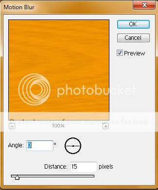
paper02.jpg


6. Click on Filter -> Render -> Lighting Effects, and use settings similar to what I present below. Be sure to use Directional light type, for an even lighting effect, and change Texture Channel to Red, as this will texturize your clouds:

paper03.jpg


7. After using the above filter, you should end up with something like this:

paper04.jpg


8. Alright, that is just too flashy, so let's use the hue/saturation tool to calm it down a bit, Image -> Adjustments -> Hue/Saturation (Ctrl/Cmd+U):

paper05.jpg


There, much better. You're done with creating paper. Now let's make the parchment:


Parchment

1. Alright, let's cut out some parchment out of this slab of paper. Use the Rectangular Marquee tool (Shift+M) to choose an area about the shape/size of your parchment.

2. Click on the Channels tab, then Save selection as channel. Your channel is now Ctrl/Cmd+4.

3. Click on your channel (should be named Alpha1), then deselect all Select -> Deselect (Ctrl+D).

paper06.jpg


4. While still in the Alpha channel, cut on the edges of your selection, using the Eraser tool (Ctrl/Cmd+E) with an erratic brush (Brush Picker in Options Bar - Chalk 23 pixels).

paper07.jpg


5. Now let's cut out a few paper tears. Use the Polygonal Lasso Tool (Shift+L) and click near the edge of your image to define an odd shape. Make sure to close the Lasso (see lasso tool tutorial, here - http://www.hcgs.net/abweb/ps_lasso.html)

paper08.jpg


6. Fill the area, Edit -> Fill. It should fill with black, as shown below:

paper09.jpg


If it did not fill with black, undo your last action using Edit -> Step Backward (Alt/Option+Ctrl/Cmd+F), then change your Default Foreground & Background Colors (Shift+D).

7. Repeat steps 5 & 6 until you're satisfied with the amount of tears. Remember, you can undo a tear if you're not satisfied with it, but don't wait too long to do so, or your history will have been overridden (Alt/Option+Ctrl/Cmd+F). Try undoing a tear right now, just for craps & giggles.

8. Once you completed all your tears, use the Wand tool (Shift+W) to choose the black area in the Alpha channel.

9. Return to your Layers, click on the paper layer and Copy/Paste (Ctrl/Cmd+C, Ctrl/Cmd+V). A new layer will have been created in the shape of your rough-edged parchment.

paper10.jpg


10. Now turn off the eye on your original paper layer to show the paper cutout.

11. And now, we're going to fold a corner. Create a new layer Layer -> New (Shift+Ctrl/Cmd+N).

12. In the new layer, use the Rectangular Marquee tool (Shift+M) to choose a small area, then fill that area, Edit -> Fill (or you can use the Paint Bucket (Shift+B) to fill the selected area).

paper11.jpg


13. Now we're going to rotate that layer using Edit -> Transform -> Rotate (Ctrl/Cmd+T). Give it about a 40 to 60 degree angle (eyeball it) and then move your selection to cover a corner of the parchment (be sure to cover the entire corner):

paper12.jpg


14. Now let's cut that corner off (the little rectangle should still be selected, but if not, then use the Magic Wand Tool (Shift+W) to select the area of your little rectangle).

Click on your parchment layer and Cut/Paste (Ctrl/Cmd+X, Ctrl/Cmd+V). The corner will have been cut off the original parchment and a new layer created (Oh right, click on your little rectangle layer and turn off the eye so you no longer see it).

paper13.jpg


15. Click on the new layer, then flip it horizontally and vertically using Edit -> Transform -> Flip Horizontal, Edit -> Transform -> Flip Vertical.

16. Alright, now let's use the Move Tool (Shift+M) to move the corner up to where it used to be attached (eyeball it). Now let's distort it a little, using Edit -> Transform -> Distort. This will give it a more realistic look:

paper14.jpg


17. And now let's cut away on the edges of the corner to give it a more rounded look. You can use a simple round eraser or an eraser with a bit more edginess to it. I prefer using the Eraser tool (Ctrl/Cmd+E) with an erratic brush (Brush Picker in Options Bar - Chalk 23 pixels).

paper15.jpg


18. Now we're going to create the shadow. Copy the corner layer (Layer -> Duplicate Layer), you'll automatically be directed to the new layer. Let's change its brightness/contrast. Layer -> Adjustments -> Brightness/Contrast, turn it into black mass (-100/-100).

paper16.jpg


19. Move it behind the corner layer, Layer -> Arrange -> Send Backward (Ctrl+[).

20. Let's distort it a little, using Edit -> Transform -> Distort:

paper17.jpg


Use the eraser (straight round eraser, 100% opacity) to clean up any parts of your shadow that may have fallen out of place (like over the top/left edge).

21. Let's blur that shadow. Click on Filter -> Blur -> Gaussian Blur. Give it a radius blur of about 2.5 pixels.

paper18.jpg


Finally, change the opacity of that shadow layer to about 80% or whatever your lighting defaults accommodate (this is where you need to use your instincts, and make your shadows consistent throughout, so the shadow of this corner should be consistent with any other shadow settings you may be using, as shadow opacity contrast matches the strength of your images' overall lighting. Ugh, and things get complicated if you have more than one light source, but that's for a different tutorial, assuming I ever get around to it, hehe).

22. Okay, back to the corner layer. Click on the corner layer, now use the Magic Wand Tool (Shift+W) to choose the empty area surrounding the corner. Alright, now Select -> Inverse (Shift+Ctrl/Cmd+I). This will ensure the next actions we take will only effect the corner layer.

23. Click on that cute little half-moon image on the bottom of the layer window, titled "Create new fill or adjustment layer" (see my earlier tutorial on [jumpto=basics]Important Basics[/jumpto]), choose Gradient, set to linear at about -45% angle. Now click on the Gradient image within the pop-up window, and it will open up a second window titled Gradient Tool Editor. Adjust the editor according to the image I provided below. Read up on how to use this editor here (click here).

paper19.jpg


Now, a little explanation: There are a lot of ways to access the Gradient tool. This way, however, creates a completely separate layer, which is good, because it doesn't mess with your original layer and I recommend you use this approach over any of the other uses of the Gradient tool or other similar tools. Creating a separate layer and/or a mask is a far safer, more professional approach to using utilities such as Gradient. It also gives you a lot more flexibility in later stages of your education on Photoshop, particularly since you can adjust that separate layer to your hearts content without adjusting your original layer.

24. Wow that's a lot of steps, but look at what you ended up with:

paper20.jpg


Dang, and we're not done yet. We now need to age it a bit.

25. Click on the parchment layer, now use the Magic Wand Tool (Shift+W) to choose the empty area surrounding your parchment. Alright, now Select -> Inverse (Shift+Ctrl/Cmd+I).

paper21.jpg


26. Create a New Layer (so you do not mess with your original parchment), Layer -> New (Shift+Ctrl/Cmd+N).

27. Be sure you're on this new layer, let's call it the Age layer. Now you're going to do a little painting with your Paint Brush (Shift+B). choose a soft brush (Airbrush Soft Round 65 is good for this task). Now paint around the edges of your parchment. If you turn off your parchment layer, you should see something like this:

paper22.jpg


Once you're satisfied, change the Age layer to a Linear Burn with about 40% opacity, turn the parchment layer back on and you should end up with something like this:

paper24.jpg


28. Save your work, File -> Save (Ctrl+S).

29. Merge everything together, Layer -> Merge Visible (Shift+Ctrl/Cmd+E). Save this under a different file name, using File -> Save As (Shift+Ctrl/Cmd+S).


Text

Now let's add some text that will go well with your parchment. To make this work, you need to pick a text that looks appropriate for the times (after all, you are posing an aged parchment). You also can't just slab text right on there, you need to get it to fit and feel right. So here we go:

1. Create a text box (Shift+T), by clicking on the area and dragging to create a box.

2. Type out what you want to say. Easy enough, right? Nope, because now you'll also need to change the font size and mess with it a bit before you get the right fit and feel. That's on your head, I'll not bother with showing you how to work with text. Plenty of tutorials out there on that.

3. Let's get it to stand out a bit more in the parchment, by adding an outer glow, Layer -> Layer Style -> Outer Glow:

paper25.jpg


4. Right, so then, we need to go the next route, which is to give that text a bit inconsistency. But, before we can do this, you need to rasterize that text, Layer -> Rasterize -> Type.

5. Click on Filter -> Distort -> Wave. Choose the below settings, or something more mild than this. You're only trying to give it a little bit of distortion, nothing too dramatic.

paper26.jpg


6. Now grab your Eraser tool (Shift+E), use a small brush, 100% opacity, and erase any parts of your text that overlays the page curl or falls within one of the paper tears.

7. Copy the layer twice, (Layer -> Duplicate Layer), (Layer -> Duplicate Layer). Change the lowest two layers to a layer setting of Difference at 100% opacity and the top layer to a layer setting of Darken at 40% opacity. And this is what you should end up with:

paper27.jpg


And you're done!

[jumpto=table]Return to Table of Contents[/jumpto]
 
Last edited by a moderator:

DeletedUser

"Important Basics" and "How to Make Wood" are now Completed. Let me know if you encounter any errors.
 
Last edited by a moderator:

DeletedUser

The how to make wood tutorial is very nifty. Thank you for posting, this section is desperately in need of tutorials. (I will post some once i get the OK from there owners)

:)
 

DeletedUser

HIHI, I'd recommend the person making the tutorials have the ability to do the things, not taking other peoples tutorials.
 

DeletedUser

I completed the Parchment tutorial <[jumpto=parchment]click here[/jumpto]>.

I'll be adding a "Copyright & Usage Licenses" section later, for those of you still struggling with what's "acceptable use." ;)

Let me know if you find these tutorials helpful. Kinda hard to gauge, without input, whether anyone is actually learning anything from them.
 

DeletedUser

As no interest on Photoshop tutorials was noted, additional Photoshop tutorials may be provided upon request. I will eventually provide the "Copyright & Usage Licenses" tutorial. Writing tutorials will be provided when I get around to it. :)
 

DeletedUser28839

paper

Can't make paper!, stuck at step 5!please check if you missed something!
 

DeletedUser

If you performed step five, please make a screenshot and send it to me in a pm
 
Top